Cancer Research UK
Improving the Group Sign Up Experience
Research | UX Design | UI Design | Systems Thinking
Summary
I joined the project to overhaul the group‑registration experience for Cancer Research UK’s flagship events, including Race for Life, Shine, and The Big Hike. With insight from supporter surveys consistently highlighting how confusing and frustrating the process felt for groups and internal data showing high drop‑off rates, increased calls to customer services, incorrect or incomplete data, and missed opportunities to capture marketing consent from additional participants, there was a clear opportunity in this area.
I helped identify why this was a problem and designed two journeys, one for the person making the booking and one for the additional participants, to ensure both business needs (clean data & marketing consent) and user needs (a quicker process and more confidence of data) led the design direction.
Understanding
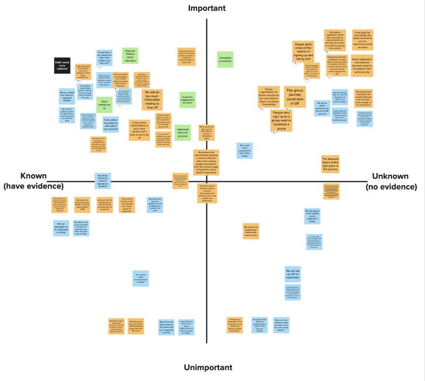
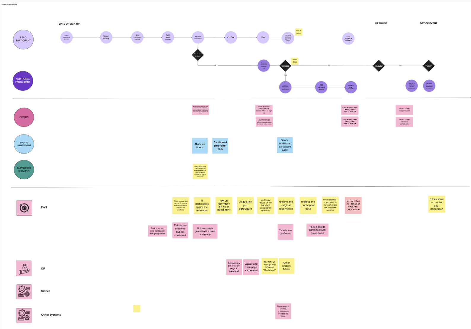
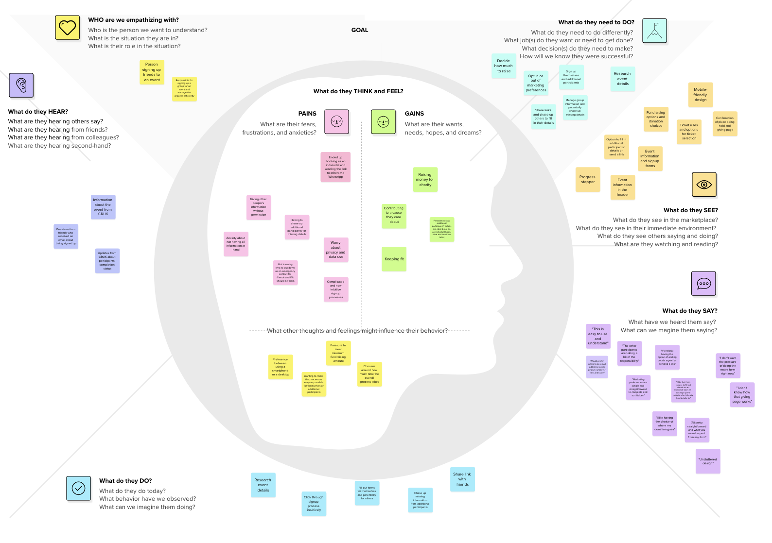
Through a series of workshops and multiple rounds of stakeholder interviews, we mapped out all existing assumptions around the group‑registration journey. This helped us separate what we knew, what we believed to be true, and where we had little evidence.
Assumption mapping
Hypothesis & Research
Those gaps became the foundation for our research plan and shaped three core hypotheses to test:
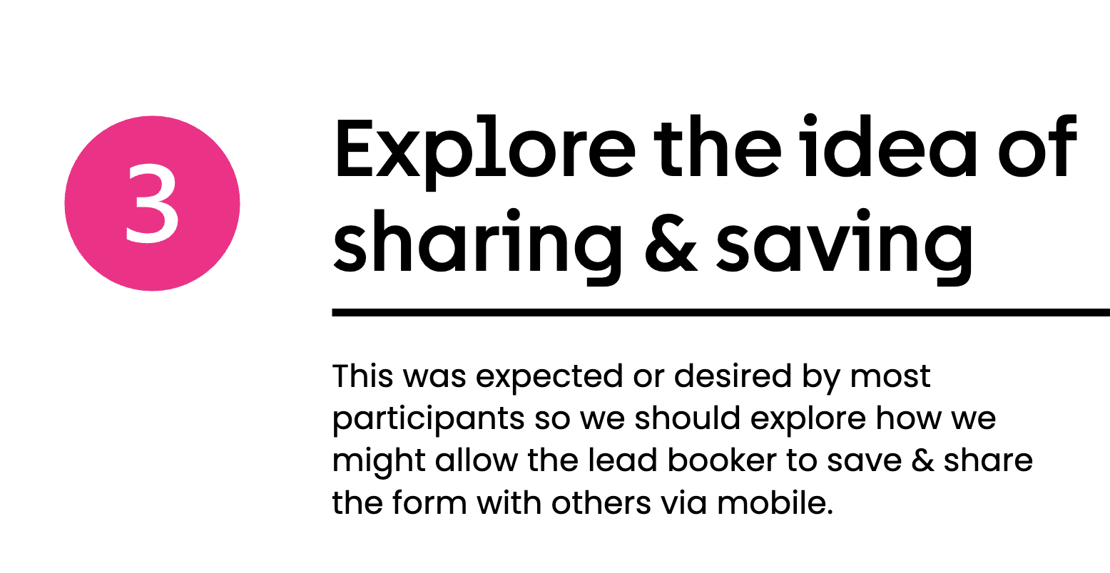
Providing groups with a direct link to their team would increase conversion.
Allowing users to save their progress and return later would improve the overall experience.
Enabling the lead booker to easily share the journey would boost consent capture, registrations, and engagement from additional supporters.
To explore these hypotheses, I initially conducted nine user interviews. These sessions included walkthroughs of the current journey, competitor comparisons, and reviews of adjacent experiences such as ticketing and travel booking. This broader lens helped us understand what users expect from modern group‑based purchase flows and surfaced several insights that informed the first direction for design.
Insights and Design Direction
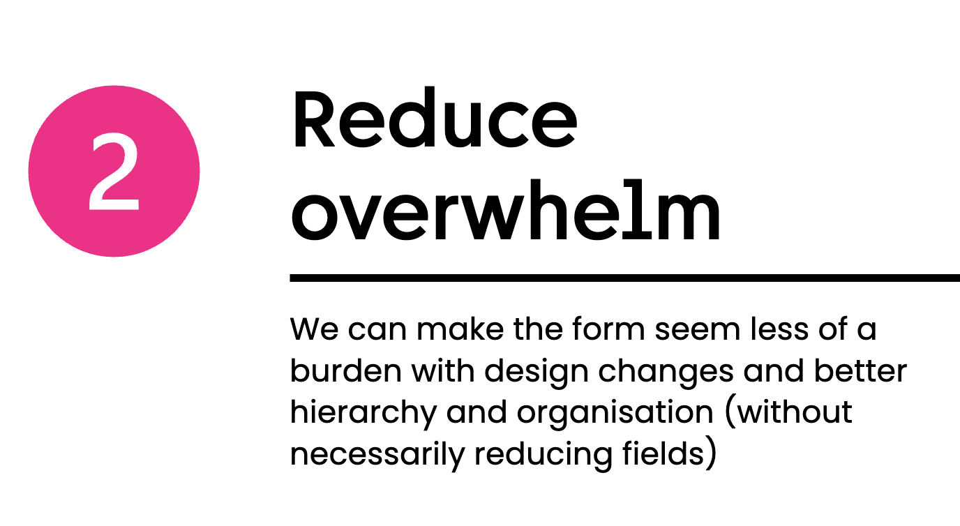
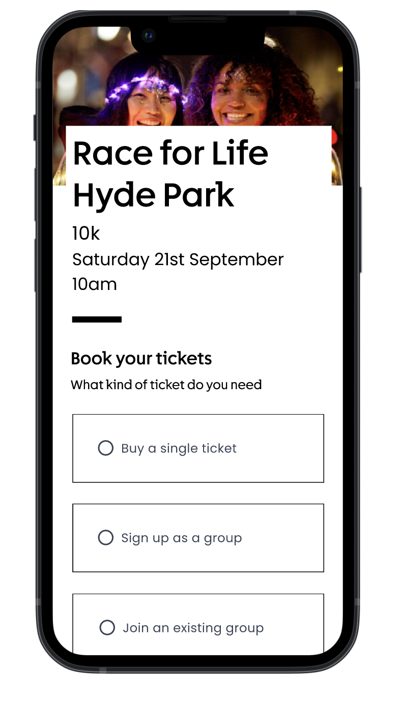
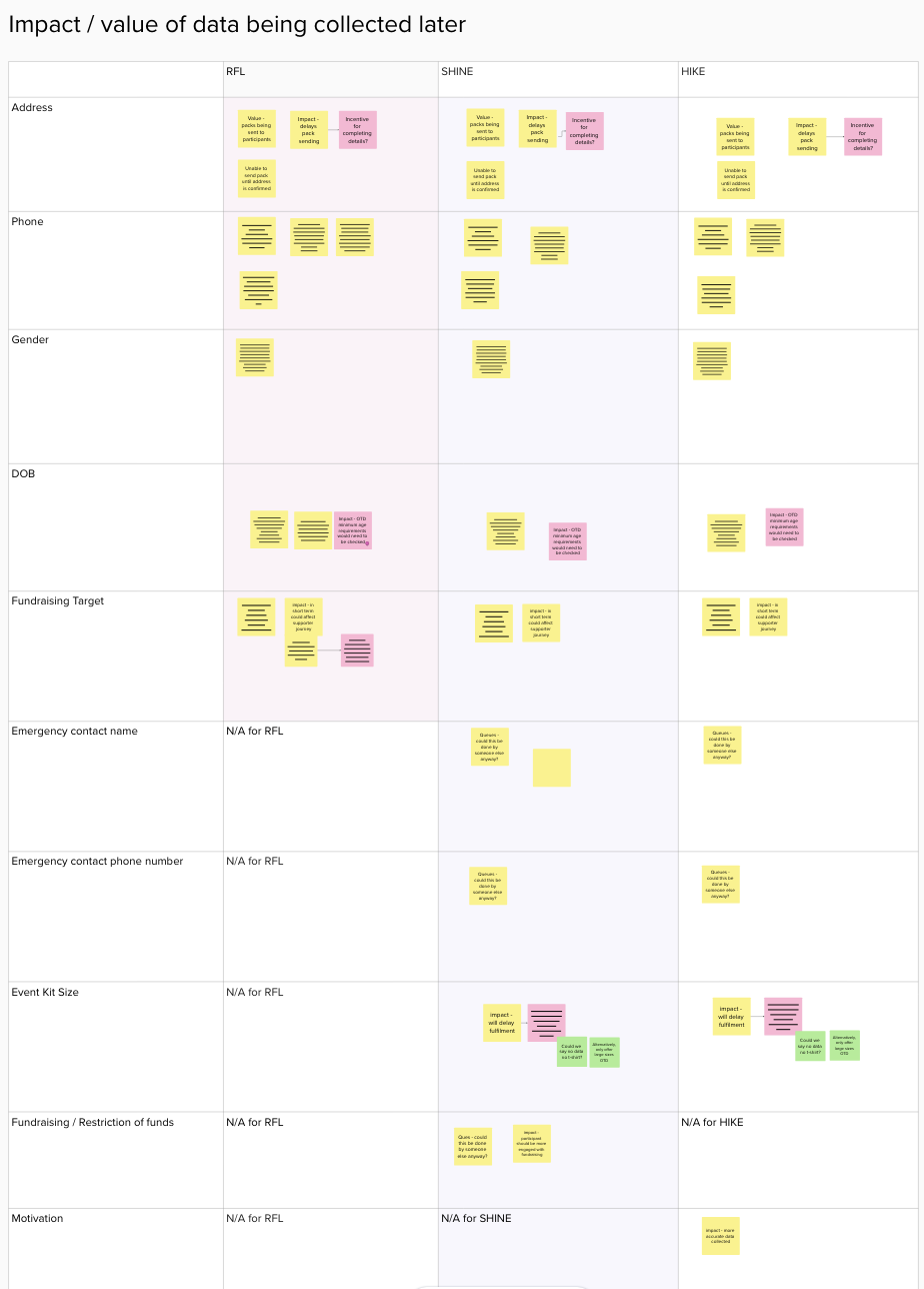
With a better understanding of what was important to uses: efficiency, transparency and a sense of control over their data and what was less important: focusing on fundraising together and paying together we were able to start designing the right journey for both user groups, the lead booker who would be organising, and the additional participants who would be taking part. We knew we need to shift some of this load off of the lead booker but we weren’t sure how likely and how keen additional participants were to fill in their own data.
Too little for additional participants
“I would be completely OK to write my details as I don’t want people spending all that time writing all my details and going back and forward,"
- additional participant
Too MUCH for lead booker
“I feel like it was a lot of responsibility to enter the information at the time,”
- lead booker
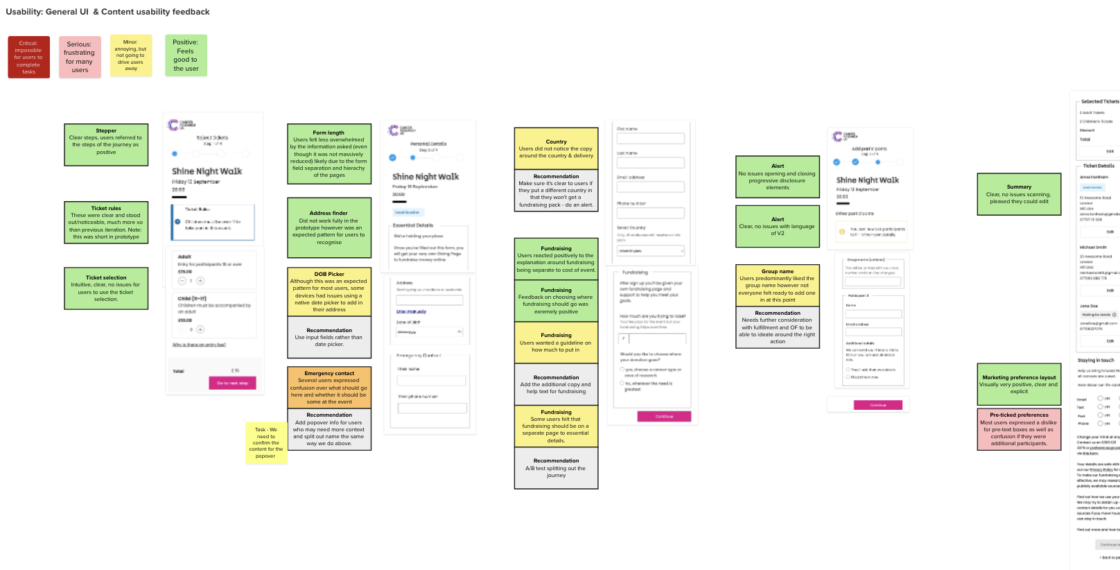
Initial designs and testing with real people
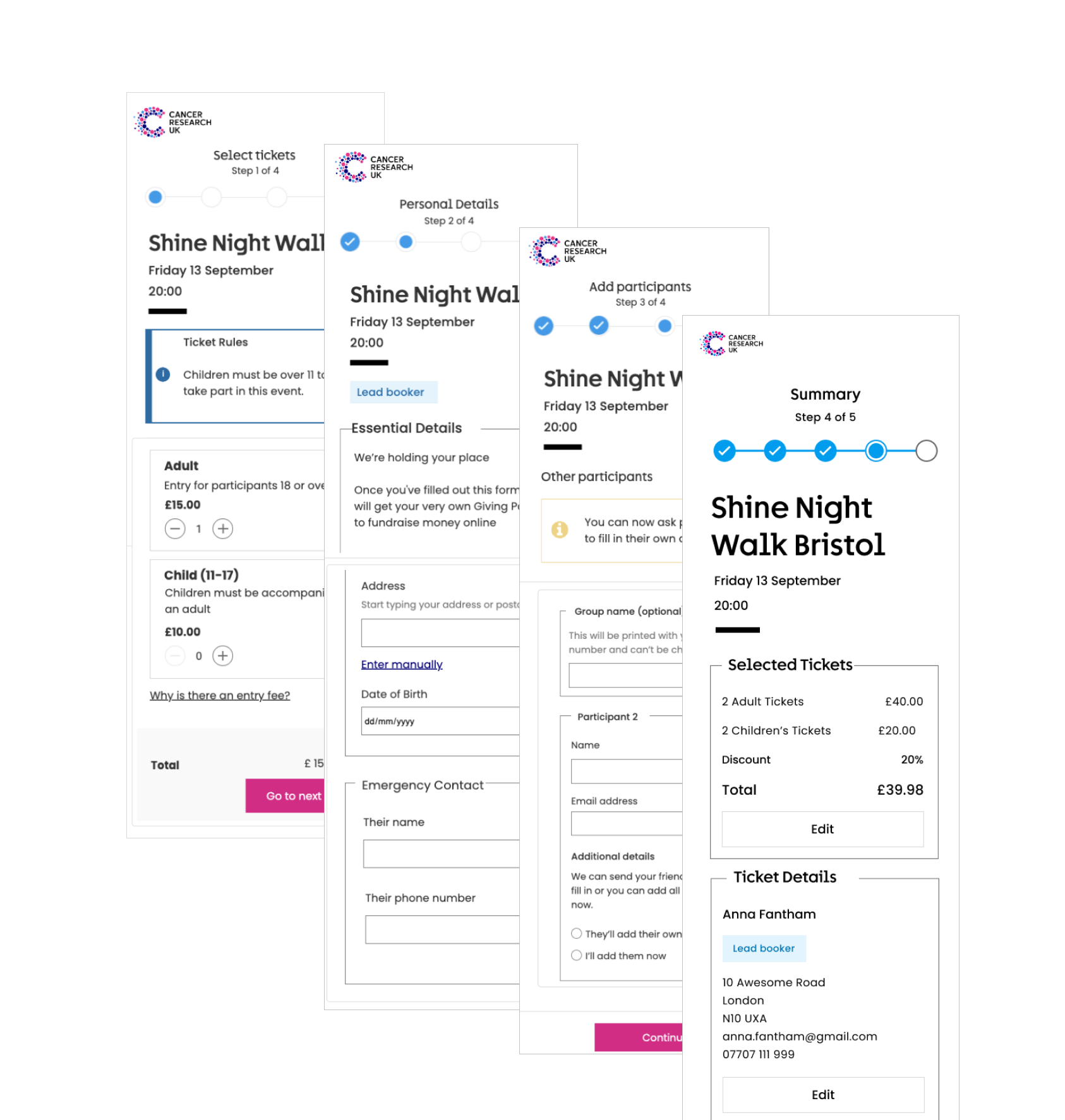
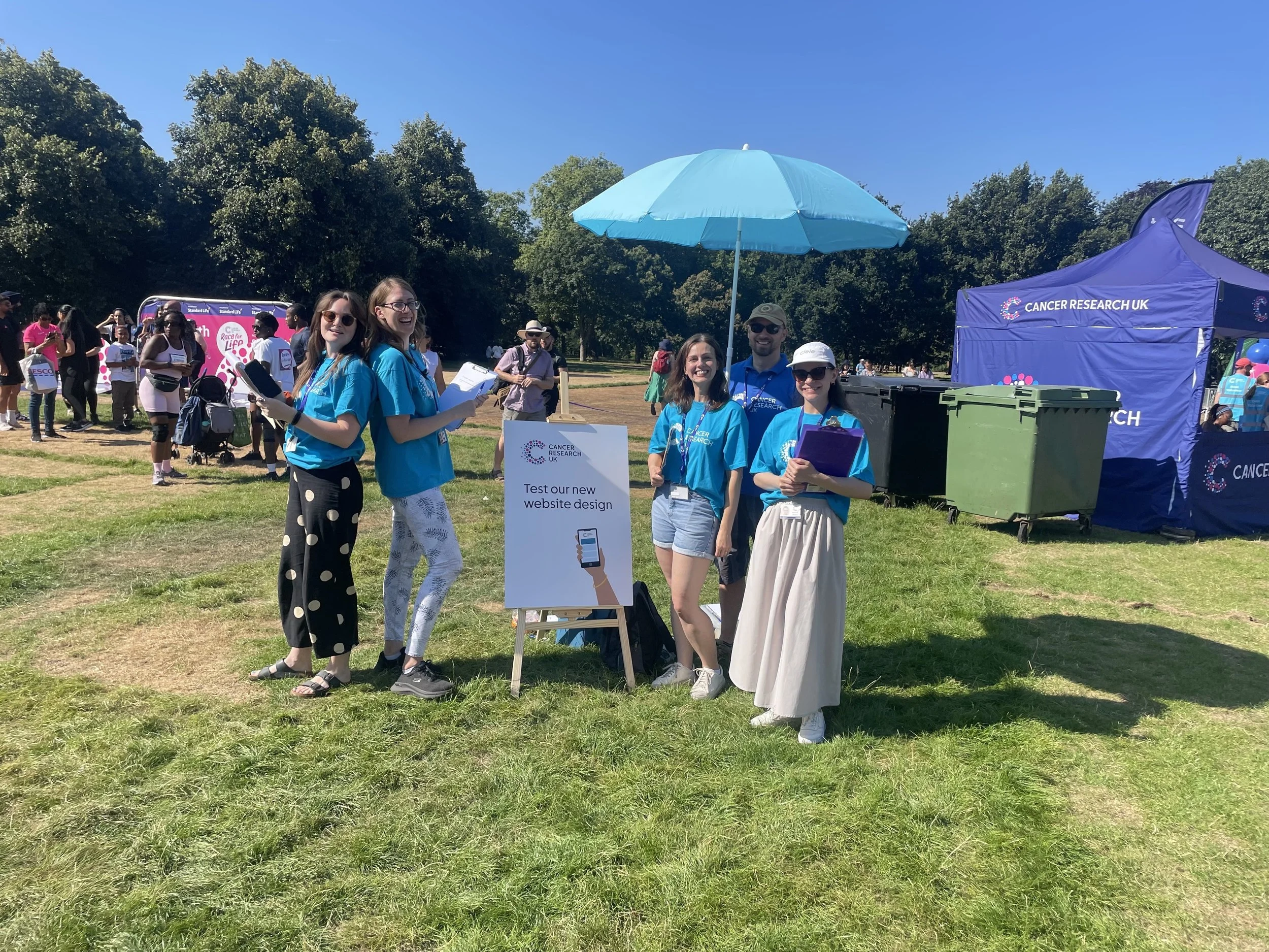
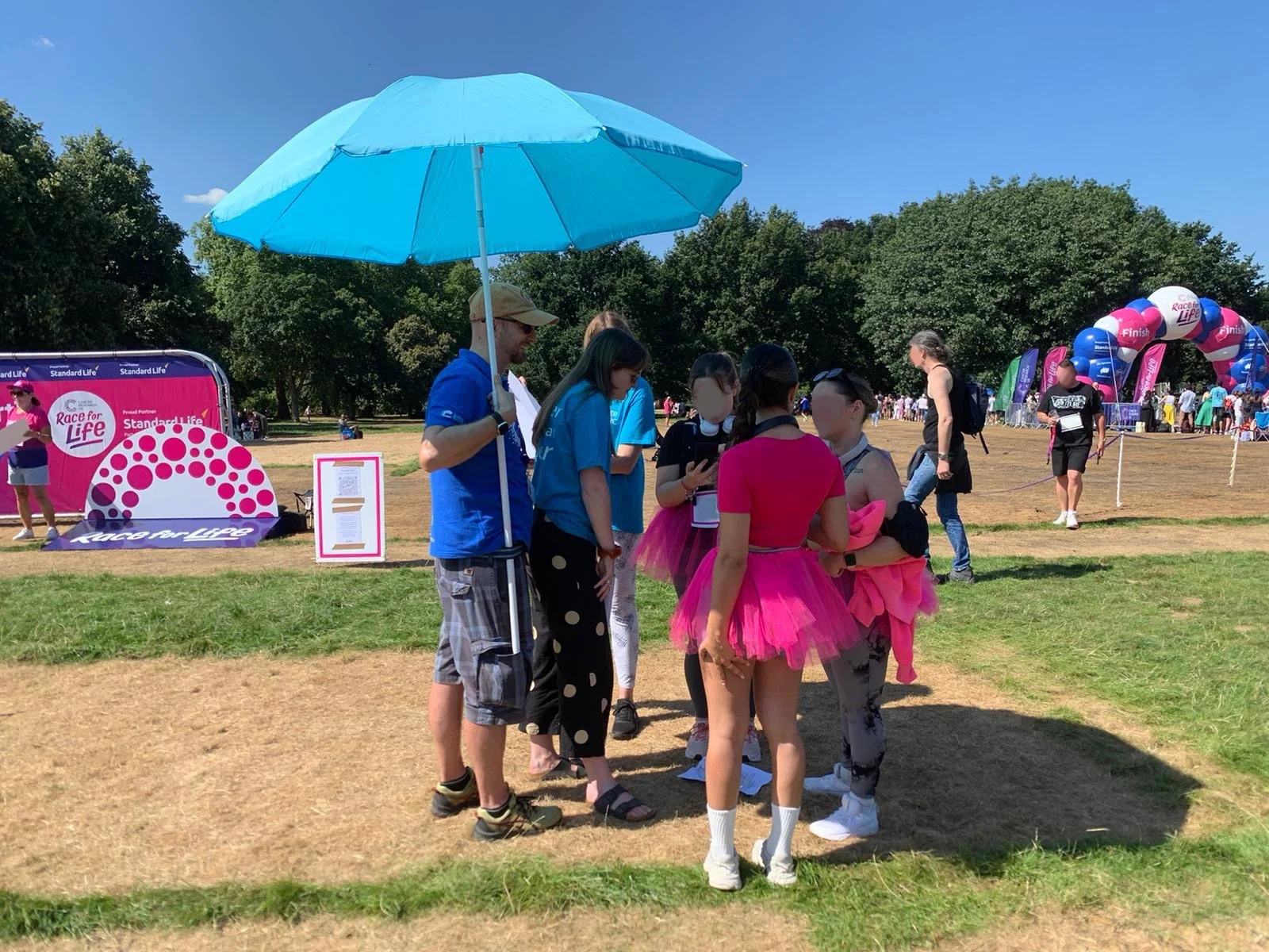
I organised a guerilla testing event with event organisers at the flagship Race for Life event in Hyde Park, London and brought some of the team who worked on other parts of the journey along with me. Armed with consent forms, a simple click-through prototype in Figma, recording devices and enough of us to divide and conquer question-asking and notetaking, we found users who fit the group-sign-up remit, talked to them about their journeys this far and put the prototype in their hands to understand how the new journey compared to their current one.
Iterating and aligning teams
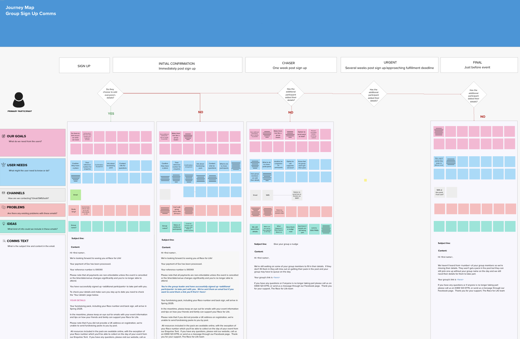
Armed with initial feedback and some useful critiques, I could start to refine the designs. I organised workshops with stakeholders and tech teams to assess the feasibility of the journeys and start to consider how the whole journey would work if we implemented a two stage sign up journey which would also need to work with a comms plan that worked alongside marketing and informational comms, as well as a feasible on the day back up plan if we only had some information available.
User testing updated designs
I created a much more interactive prototype on Axure.rp to ensure true representation of the feeling of filling in data for themselves and for others, respond to the duration of it and to make sure I had enough of a perspective from different persona groups (warm to CRUK and new users) and different user groups (lead and additional participants) I tested with 12 participants. We tested a few different variants to see how participants responded to different quantities of data being asked for and tried to guage response times and expectations around on the day experiences.
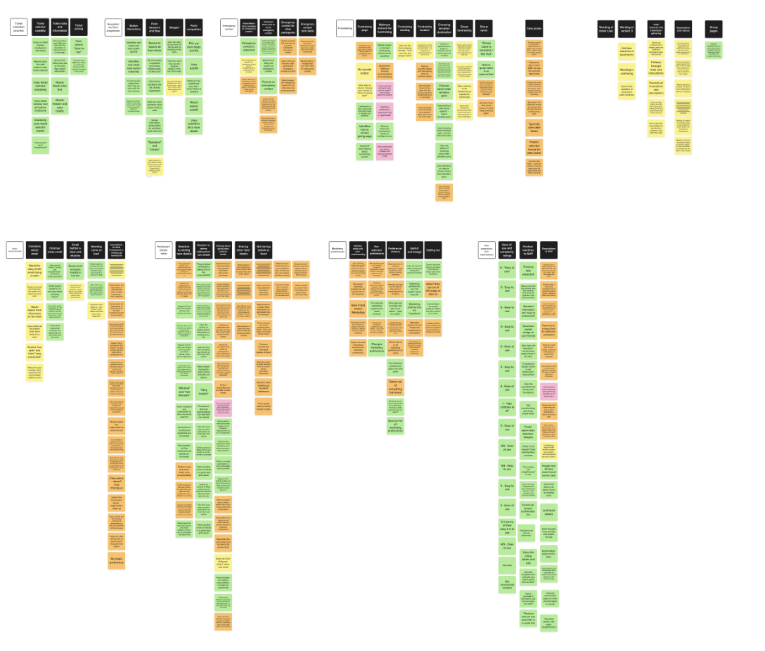
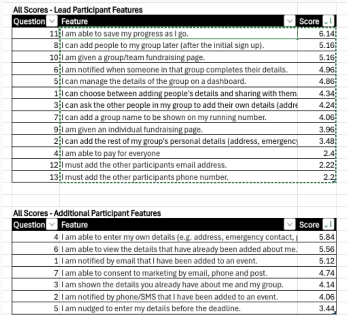
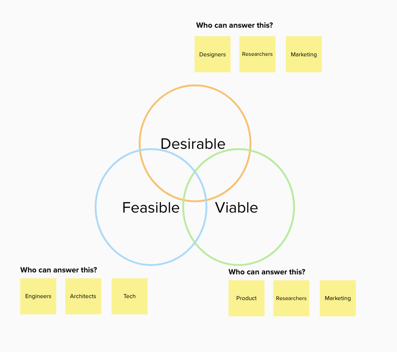
Analysis and prioritisation
Analysis of the user tested prototypes led us, including prioritising features by desirability and feasibility gave us a clear design to handover to developers. I then worked with marketing to create a comms journey to ensure participants provided the data by the day and worked with them on a contingency plan for on the day delivery.
Results so far
While all stakeholders agreed to a build and release of the journeys, the final version has yet to be been implemented due to a data migration project taking priority. However, a smaller MVP version has been been built and released and has seen conversion increase by 67% and a further 8% increase in marketing consent.