ASOS MARKETPLACE
Seller Platform Re-design
The short version
Designed a bespoke seller platform specifically for the needs of ASOS marketplace sellers, making sure their needs were front and centre.
BACKGROUND
Known as ASOS’s cool little sister, ASOS Marketplace connects independent sellers to ASOS customers. Launched in 2010 ASOS Marketplace was one of the only places to connect independent sellers directly to customers. In 2020 having grown to be home to close to 1000 sellers within a much more competitive landscape, the system was being pushed to its limits.
I joined the team as the re-platforming was under way, which initially was due to move to a white label UI. However, as part of my research (in person observation, video interviews and surveys), I found that our sellers were using competitors in a way that the proposed UI didn’t cater for, that our existing (albeit out of date and clunky) system had a lot of positives that would be missed if we were to commit to the new UI, and that there were other potential features which could be real delighters if we were able to shift some resource to them.
With the support of the product and engineering team, we convinced important stakeholders to let us move to a new back end system but instead of using their UI, to redesign our existing platform. With their backing, I was able to design a fully responsive user-led seller management system.
Research
USER INTERVIEWS AND OBSERVATION
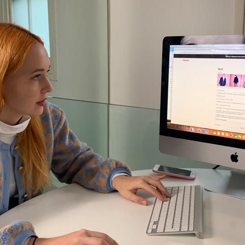
Getting to know the sellers, seeing how they worked and understanding their needs was the key to initial work. Myself and my product manager spent several weeks some talking to them on the phone and in person, and observing their day to day management of their business, including using Marketplace and competitor platforms.
We learned:
Who they are, how they started and what they plan to do
How existing sellers use the current system and competitors
Challenges they face at the moment
Shortcuts they take to get to what they want
What they would like to change
What they would miss if it went away
INSIGHTS
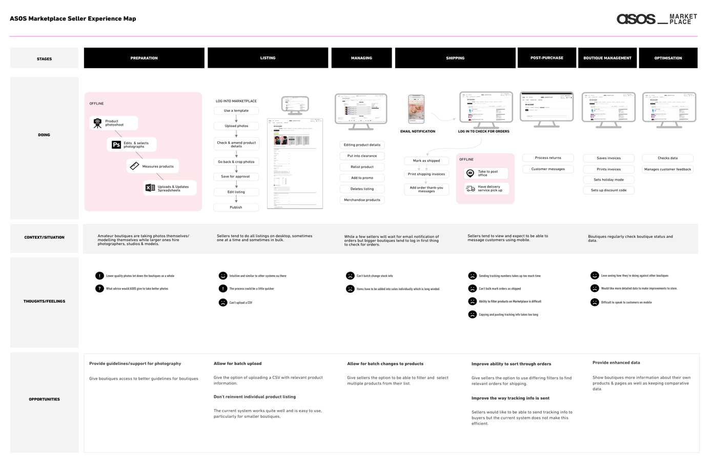
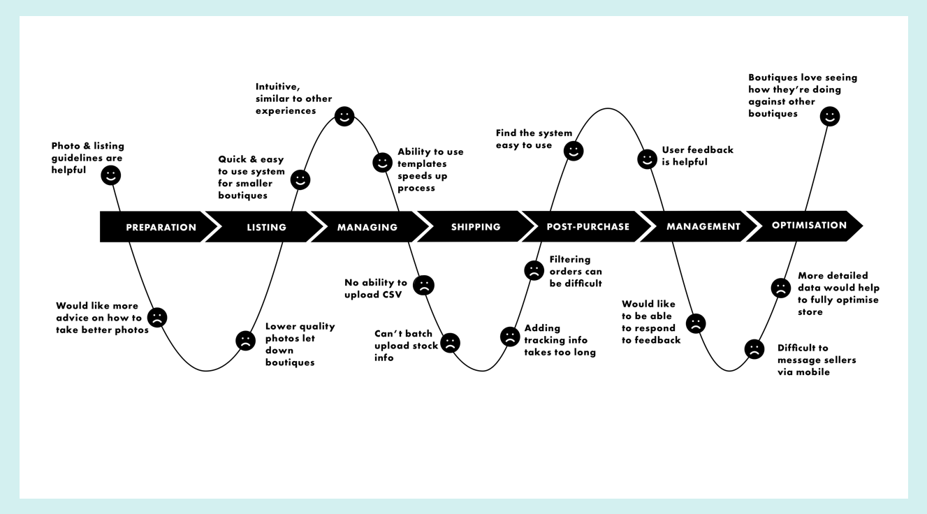
Using the research I created a user journey map to help illustrate our findings and present how users felt to the wider team. I broke this down into seven stages, illustrating the steps our users take to list and manage their products on site, as well as highlighting where in the journey they found pain points and positives within the current system.
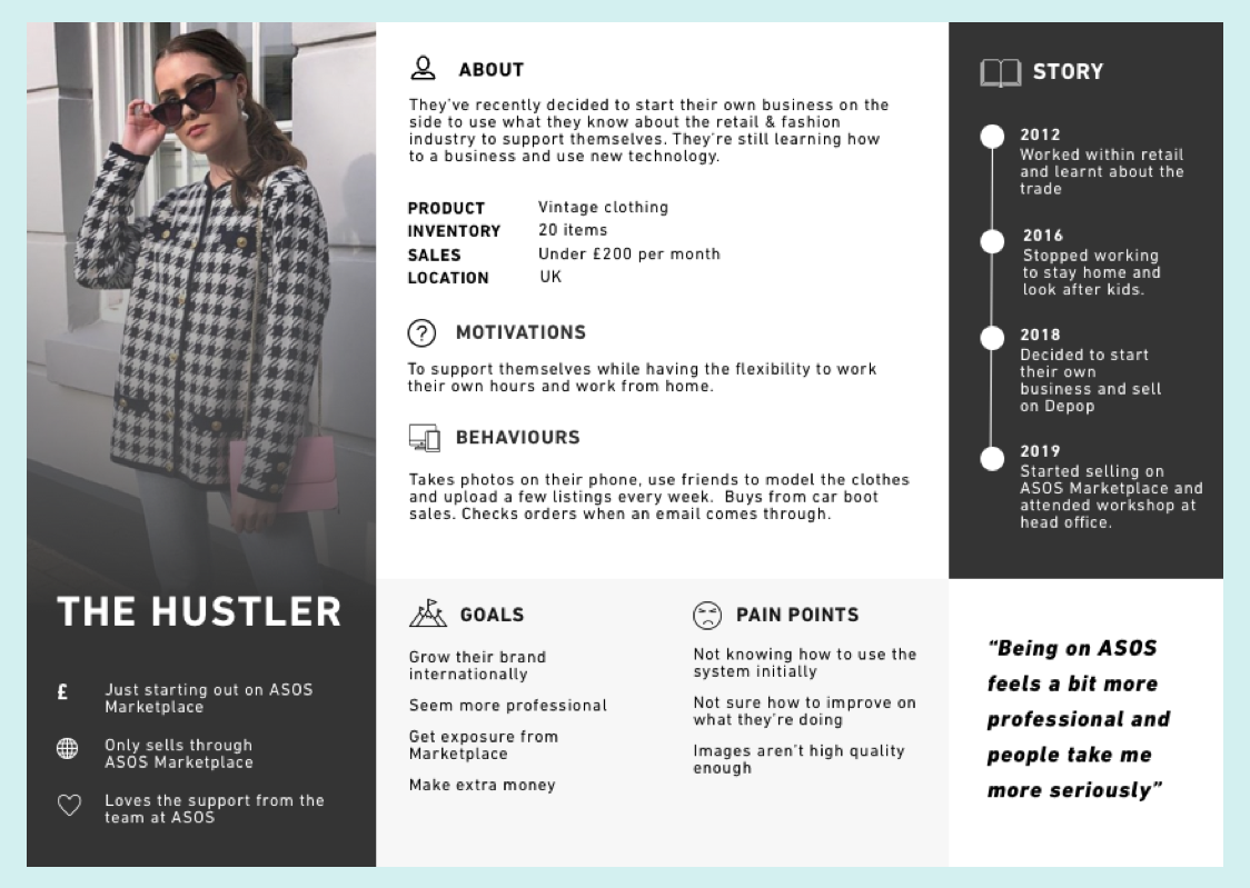
PERSONAS
From talking to different boutiques I found that there distinct needs which largely depended on the size of the seller’s business and the sort of products they sold, so I created three different personas to help our product design strategy and make sure we were designing for multiple types of users: The Hustler, The Big Indie & the Shop Owner.
We found the smaller brands were looking for more support, more visibility and ability to upload on the go. The larger sellers needed the ability to upload in bulk and make changes easily for multiple users on a desktop. Knowing the different needs helped us identify the key areas to address and how.
Strategy and Design Direction
DEFINING THE VISION
I worked with the product owner to help define the product strategy through a product opportunity tree and lean canvas model. We used this and the insight we’d gathered to argue for a new seller portal design, rather than an upgrade to the white label UI which had already been agreed by the business. The power of the user research and opportunities presented led the business to approve our new product plan.
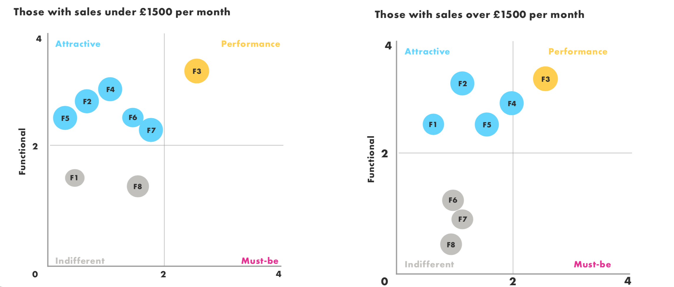
KANO SURVEY
We narrowed down the initial features we could build into our new system. Knowing we’d have to prioritise this I surveyed our user base to the product team prioritise the features we would be doing next.
The results showed some distinct differences in feature priority for our different personas and we weighed up the desirability of the features alongside cost and time implications.
Design
To help the business visualise the features fully and start gathering feedback from users, I redesigned the full user journey and created a prototype for testing.
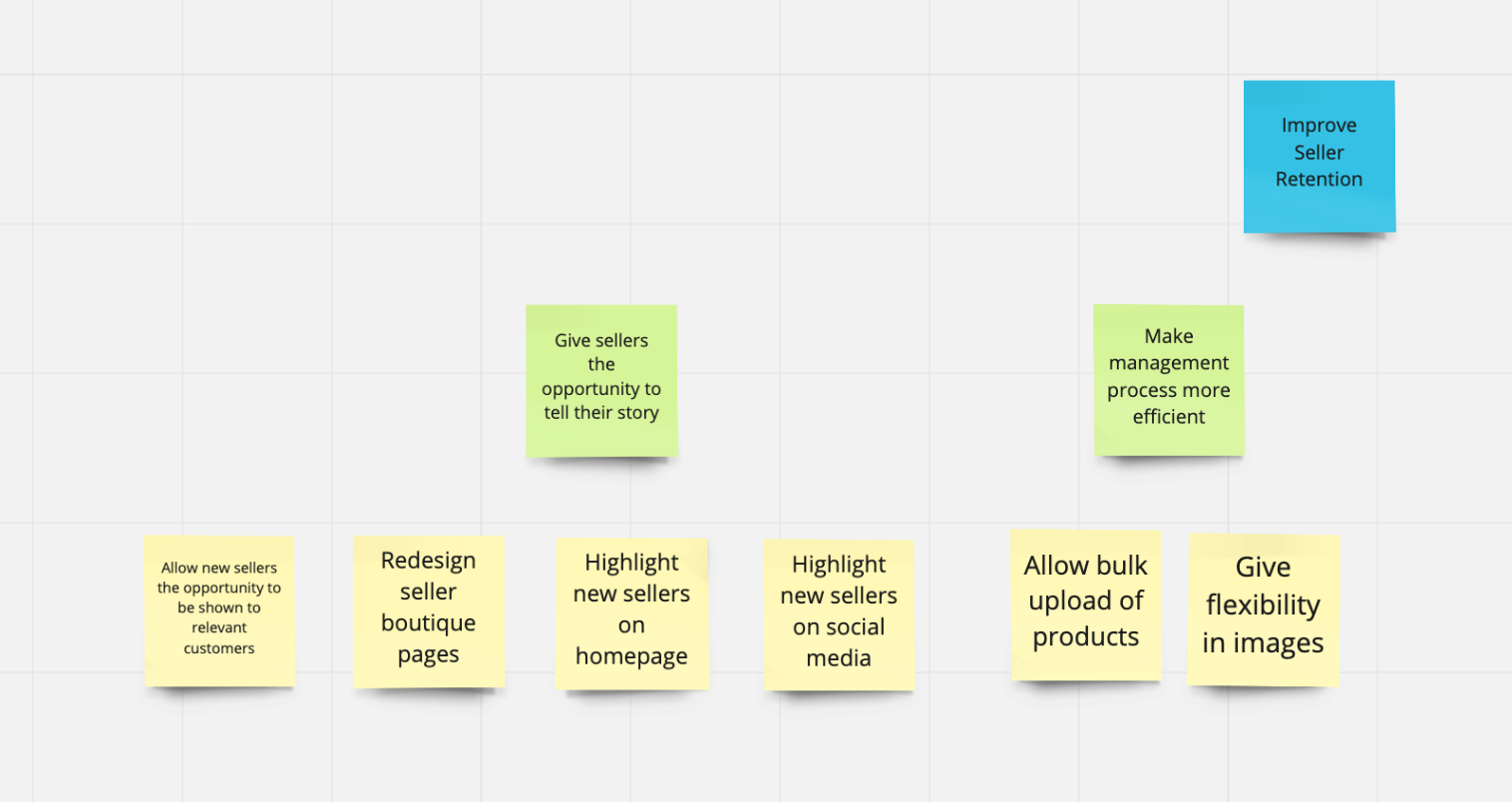
Key features
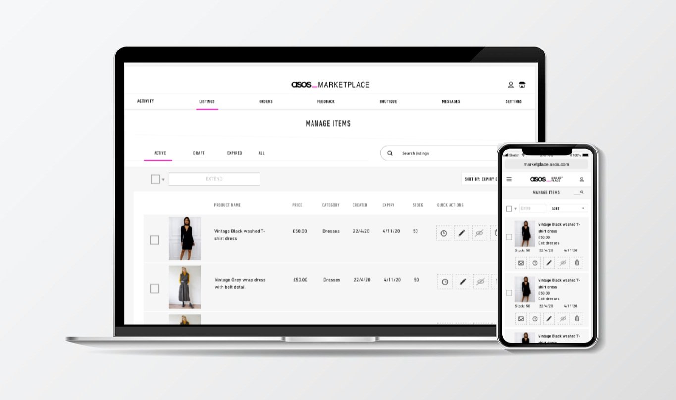
A simpler navigation system
A dashboard for users to view their highlights, based on user feedback
A product uploader which was more in line with competitors but keeping the features users liked about the current system
A bulk upload feature requested by larger sellers
Bulk key actions for orders
A clearer, mobile friendly user interface
Accessible fonts
This was used to get buy in from other areas of the business to prioritise the rebuild and I used it for user testing sessions with representatives from our different user groups to help further understand their needs and refine the designs for when the time came to refine the designs and features.
"It looks a lot more professional, but still on brand and bespoke”
- Marketplace seller